The Lab · Business
How I Decide a RAXXO Tool Needs a Redesign, Not a Patch
A patch fixes one report. A redesign answers the same complaint from four different users, and I only reach for one after the other stops working.
Each line jumps to its section
- I track three signals before I touch a shipped RAXXO tool's core screens again
- A patch fixes one report, a redesign answers the same complaint from four different users in a month
- The kill switch buys me the room to redesign without breaking anyone mid session
- I never touch export formats or saved URLs during a redesign, only the screens around them
The Line Between a Patch and a Redesign
Every RAXXO tool gets bug reports. Most of them are patches. A button that does not respond on a specific browser width, a label that reads wrong after I renamed a feature, a form field that swallows a paste. I fix those the same day, ship a small update, move on. That is maintenance, not redesign, and I used to lump both under the same mental bucket. That habit cost me time, because a patch mindset makes you fix the symptom in front of you, while a redesign question asks whether the whole screen is asking the right thing of the user in the first place.
The line I use now is simple. If I can describe the fix in one sentence and it touches one component, it is a patch. If the fix requires me to explain the surrounding context first, "well, the reason people get confused here is that the page tries to do two things at once," it is a redesign candidate. That second kind of explanation is the tell. Once I catch myself justifying a screen's structure before I can describe a fix, I stop trying to patch it.
I also watch for repetition across unrelated users. One person misreading a settings panel is a support ticket. Four people, none of whom talked to each other, hitting the same confusion inside a few weeks is a design signal. I keep a short list per tool of complaints that were nominally "different" but pointed at the same screen. When that list grows past three in a month, I stop treating the individual reports as isolated and start asking what the screen itself is doing wrong. That reframing matters, because the fix for a design signal is almost never the fix for a bug report. You cannot patch your way out of a screen that is structurally unclear. You can only rebuild it.
The third signal is quieter and easier to miss: silence. Not complaints, just a feature nobody uses that I know solves a real problem, because I use it myself. When usage and value are that far apart, the problem is usually presentation, not the feature's worth. That is a redesign conversation with myself, not a bug I can log.
The Checklist I Actually Run
Before I open a design file, I run through four questions, in this order, and I do not skip ahead even when I already suspect the answer.
First: is this a single screen or a flow? A redesign of one settings panel is a weekend of focused work. A redesign of an onboarding flow touches every screen after it, and I plan for that scope honestly instead of discovering it three screens in.
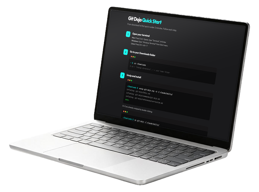
Second: what does the user lose if I get this wrong? For OhNine, a menu bar app, the answer is trust in a glance. People check it in half a second between tasks. If a redesign adds friction to that glance, I have made the tool worse even if it looks sharper. For Git Dojo, a terminal first teacher, the redesign risk is different: adding visual polish that fights the terminal aesthetic the whole tool is built around.
Third: can I ship it behind the same kill switch I put in every RAXXO tool? If a redesign can roll out gradually and roll back instantly if something breaks, I take more risk with the layout, because the downside is bounded. If it cannot be toggled off cleanly, I move slower and test longer before anything reaches a live user.
Fourth: does the redesign change what the tool promises, or just how it delivers on that promise? I redesign screens constantly. I almost never redesign what a tool is for. The moment a redesign starts changing the tool's core promise, I treat it as a new product decision, not a design pass, and that gets a longer look before I commit.
Running these four questions before opening a design tool has saved me from at least two redesigns that would have made a tool prettier and less useful, because the checklist forced me to name the actual problem before reaching for a visual solution.
I also write the answers down before I start, in a short note next to the tool's changelog entry for that release. Not because anyone else reads it, it is a studio of one, but because writing "this redesign is scoped to the settings panel, the export format does not change, the kill switch covers rollback" forces a commitment I can check myself against later. Redesigns have a way of growing while you work on them. A screen that seemed cleanly scoped on day one starts pulling in a neighboring screen by day three, because the two never looked disconnected once you are staring at both. The note is what stops that drift. If a change I am about to make is not in the note, I finish the current pass first and open a separate note for the new scope, rather than letting one redesign quietly become three.
A Redesign I Actually Shipped
The clearest example is the onboarding screen for OhNine. I wrote about the specific rewrites elsewhere, but the shape of the decision is worth repeating here because it is the pattern I now apply everywhere. The original onboarding worked. Nobody reported it as broken. But new users kept asking a support question that the screen was supposed to already answer, and they kept asking it in slightly different words, which is exactly the "different complaint, same screen" signal I described above.
My first instinct was to patch it: add a tooltip, bold a sentence, shrink some other element to make room. I shipped that patch. The question kept coming. That told me the patch had treated a structural problem as a copy problem, and copy tweaks cannot fix a structure that buries the answer in the wrong place. Only then did I open a real redesign, moving the answer to where people were actually looking first, not where I assumed they would look.
The lesson generalizes past that one screen. A failed patch is data. It tells you the problem sits one layer deeper than where you tried to fix it. I now treat a patch that does not resolve the underlying complaint as permission to escalate to a redesign, rather than trying a second, cleverer patch on the same spot.
There is a harder version of this lesson I learned later, with a different tool. I patched the same complaint twice before admitting it needed a redesign, and the second patch made the eventual redesign more work, not less, because it had added an extra state the new layout also had to account for. Two failed patches is not just a second data point, it actively narrows your options for the redesign that follows. Since then, one failed patch is my limit. If the first attempt does not resolve the complaint, I stop reaching for a second small fix and go straight to the structural question, even when a second patch feels faster in the moment. It rarely is, once you count the redesign it eventually forces anyway.
What Stays Untouched During a Redesign
A redesign has a blast radius, and I keep it as small as the problem allows. Three things never move, no matter how tempting a clean slate looks.
Saved URLs and links people have bookmarked or shared stay valid. Breaking a link because a page got prettier is a self inflicted support inbox problem, and I have enough of those from real bugs without manufacturing new ones from cosmetic choices.
Export formats stay stable. If a tool lets someone pull data out, whatever shape that data takes when a redesign ships has to match what shipped the day before, unless the export format itself was the thing I set out to fix. People build their own workflows around a stable export, and changing it silently breaks things I will never see reported, because the user just quietly stops trusting the tool.
And the core interaction a returning user already knows stays recognizable, even when the visuals around it change completely. Muscle memory is real. Someone who has used a tool for two months should be able to open a redesigned version and still find the one action they came for, even if everything around it looks different. I test this literally, by not looking at the new screen for a day and then trying to use it the way I imagine a returning user would, before I ship it.
Keeping those three boundaries fixed means a redesign can be aggressive everywhere else without turning into a trust problem. The visual layer can change completely. The contract with the user cannot.
Bottom Line
Patch versus redesign is not a severity question, it is a diagnosis question. A patch fixes what someone reported. A redesign fixes what the screen was actually asking of them in the first place, and you only know which one you need after you have watched the same confusion show up from more than one direction. I run the same four checks every time now: single screen or flow, what the user loses if I am wrong, whether the kill switch covers the rollout, and whether the tool's actual promise is changing. That discipline is slower than reaching for a quick fix, and it is the only thing that has kept five RAXXO tools from drifting into five different visual languages while I try to solve the same kind of problem five different ways. The screens change. What a returning user can already do without thinking should not.
Related reading: why every RAXXO tool ships with a kill switch, why I batch every RAXXO release instead of shipping one at a time, and the RAXXO tool I killed before it ever shipped.