The Lab · Design
Why Every RAXXO Tool Ships in Dark Mode First
A midnight screenshot showed a light-first build glowing like a broken browser tab. Why every RAXXO screen starts dark, and the one place it still breaks.
Each line jumps to its section
- Every RAXXO tool is designed dark first and light second, not the other way around
- The studio's text color is an off-white, never pure white, because pure white against black caused a halation effect that made small type shimmer on OLED screens
- Dark mode breaks in exactly one place if I am not careful: App Store and store screenshots shot on a black background disappear into a dark listing page
- I now test every screen at night on a phone before I call it done, because that is when a badly tuned dark UI actually hurts
The Screenshot That Made Me Switch the Order
I used to design every RAXXO screen in light mode first, then flip a switch and generate a dark variant from it. That order seems reasonable until you actually use the tool the way most people use a terminal companion or a menu bar app: at night, in a dim room, with everything else on the screen already dark.
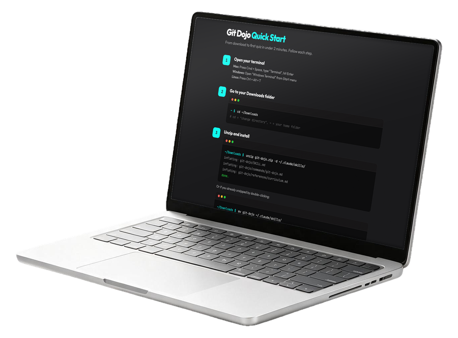
The moment that broke the habit was a screenshot I took of an early Git Dojo lesson screen, the same terminal teacher I wrote about in Git Dojo: Why I Built a Terminal-First Git Teacher. The light-first build looked fine in daylight. At 11pm, with my terminal already dark and every other app in dark mode, the tool's light background was the only bright rectangle on the screen. It looked like a browser tab that had frozen mid-load. Nothing was wrong with it. It just looked wrong, in the one setting most of its actual users would see it in.
That is the pattern with developer tools specifically. A statusline builder, a terminal teacher, a menu bar utility for watching Claude limits, these are not tools people open in a sunny kitchen for two minutes. They live next to a terminal, a code editor, and usually several other dark panes. Designing them light first and patching in dark mode later treats the exception as the rule.
So I flipped the process. Every new RAXXO screen now starts as a dark composition. Spacing, contrast, and hierarchy get solved against a near-black background first. A light variant comes after, generated from the dark one, not the other way around. It sounds like a small process change. In practice it changed which bugs I catch early. Contrast problems that would have been invisible in a light-first flow show up immediately when black is the default canvas, because there is nowhere to hide a color that is almost, but not quite, legible.
The Off-White Rule and Why Pure White Failed
Every text color across RAXXO tools is an off-white, not pure white. That was not an aesthetic preference I picked from a mood board. It came from a genuine problem: pure white text on a near-black background caused a shimmer effect on OLED phone screens, especially on small body text in Statusline Builder's preview pane. Move the phone slightly and the letters seemed to vibrate. It is a real optical effect, sometimes called halation, where maximum contrast between pure white and true black overloads the eye at small sizes.
Dropping the white down a few percent, so it reads as a soft off-white instead of paper-white, removed the shimmer completely without making anything harder to read. Contrast ratio still comfortably clears accessibility guidelines for body text, but the eye no longer has to fight a false edge around every letter. I did not believe this would matter until I put both versions side by side on my own phone in a dark room and could not comfortably read the pure-white version for more than a few lines.
This is the kind of decision that never shows up in a screenshot comparison, because screenshots do not shimmer. It only shows up on the actual device, in actual use, which is exactly why I do not trust a screen until I have looked at it outside a design tool.
The same off-white now shows up everywhere across the studio, not just in one tool. Once I had a value that worked, I turned it into a fixed rule rather than a per-project decision, the same way a shared snippet becomes a single source of truth once three tools depend on it. A design decision that took one uncomfortable night of squinting at a phone is now a constant every tool inherits automatically, instead of a choice each new screen has to rediscover on its own.
There is a second, smaller reason the off-white matters: pure white forces every other color around it to work harder to stay in its lane. Borders, dividers, and secondary text all need more contrast headroom when the brightest element on screen is at absolute maximum. Pull that one value down slightly and the whole palette gets more room to breathe, without anything reading as washed out. It is a strange thing to learn from a shimmering letter, but it changed how I think about every other color decision that follows it.
Where Dark Mode Actually Breaks
Dark mode is not free. It breaks in one place reliably: marketing surfaces that live somewhere other than the tool itself. A product page screenshot, an App Store listing image, a social preview card, all of these get placed by someone else's layout, usually on a white or neutral background chosen by the platform, not by me.
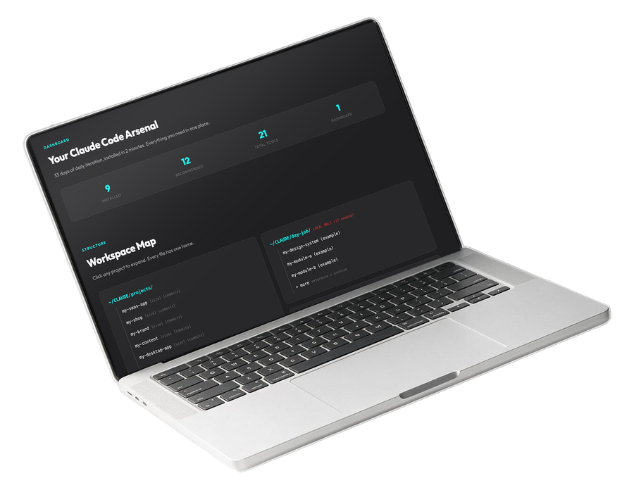
A screenshot shot straight from a dark RAXXO tool, dropped onto a bright store listing, tends to lose its edges. The tool's near-black background blends into shadows and borders that the platform itself adds, and the whole screenshot reads as a dark smudge instead of a crisp product shot. NIGHTMILE's App Store listing was the clearest case of this. The tool itself is dark by design, correctly, but the screenshot needed a deliberate light frame around the dark interface so it would read as a distinct object on a white store page instead of disappearing into it.
The fix is not to make the tool lighter. The fix is to treat marketing screenshots as their own design problem, separate from the product. Every screenshot that leaves the tool and lands on a store page, a product page, or a social card now gets a frame, a subtle device mockup, or a background block that gives the dark interface an edge to sit against. It is a small extra step, but skipping it is exactly how a genuinely good dark interface ends up looking like a bug in someone else's listing page.
The same problem shows up in a quieter way on the product pages I write myself. A hero image sitting directly on a page background needs a border or a shadow to separate it from that background, even when the surrounding page is already dark, because two dark rectangles touching edge to edge read as one shape instead of two. It is a one-line CSS fix once you notice it, and completely invisible until you do, which is exactly the kind of bug that dark-first design tends to surface that a light-first process would have hidden by accident.
I have also learned to check how a dark screenshot behaves when a customer forwards it in an email client, a support ticket, or a chat app, all of which tend to default to a white background of their own. A screenshot that only makes sense sitting on black falls apart the moment someone pastes it somewhere else, so I now hold every exported image up against a plain white canvas as a final check, the same canvas most third-party surfaces will eventually place it on whether I plan for it or not.
How I Actually Test It
I test every RAXXO screen at night, on a phone, before I call it shipped. Not because a desktop test is wrong, but because a desktop monitor at full brightness in a lit room hides exactly the problems dark mode is supposed to solve. A phone screen at reduced brightness, in an actually dark room, is the honest test.
This grew out of the same habit I described in Why I Test Every RAXXO Tool on My Phone Before My Desktop, narrowed specifically to lighting conditions. I walk through every screen with the room lights off and the phone brightness turned down, the way someone actually checking a build status or a Claude limit at midnight would have it. If any text disappears, if any border vanishes, if any button loses its edge against the background, that is a real finding, not a nitpick.
It overlaps with the checks I run in The Accessibility Pass Every RAXXO Section Gets Before It Ships, but it is not the same check. Accessibility contrast tools measure ratios on paper. A dark room with a dimmed phone measures whether the ratio actually holds up in the one condition dark mode exists for in the first place. A screen can pass every contrast calculator and still feel wrong at midnight, and the only way I have found to catch that gap is to actually be in the dark room, at midnight, looking at the phone.
I keep a short, fixed checklist for this pass now, because it is easy to skip when a tool already looks finished on a desktop monitor at noon. Brightness turned down to roughly a third. Room lights off. Every interactive element checked for a visible edge, not just visible text. Any element that only reads correctly because a border happens to catch ambient light gets flagged and fixed, because ambient light is not a design system, it is luck. OhNine's menu bar dropdown failed this exact check once, a dividing line between two sections was nearly invisible at low brightness even though it measured fine on a contrast calculator. The fix took two minutes. Finding it took doing the test in the dark, on the actual device, instead of trusting a number on a screen.
None of this replaces the calculator. It replaces trusting the calculator alone. A ratio is a proxy for how something looks to an actual eye in an actual room, and proxies drift from reality in small ways that only show up when you go check reality directly.
Bottom Line
Dark mode is not a color scheme you bolt onto a finished design. It is a different starting point, and treating it as the default instead of the exception changed which problems I catch and when I catch them. The off-white text, the screenshot framing, the midnight phone test, none of these are clever ideas. They are small corrections that only became obvious once I stopped designing for daylight and started designing for the room a terminal tool actually lives in. The next screen I build will start dark again, because at this point that is just how a RAXXO tool gets made, not a rule I have to remember to follow.